
The Invitation Asia
The room everyone wishes they were invited to
Visit Live Site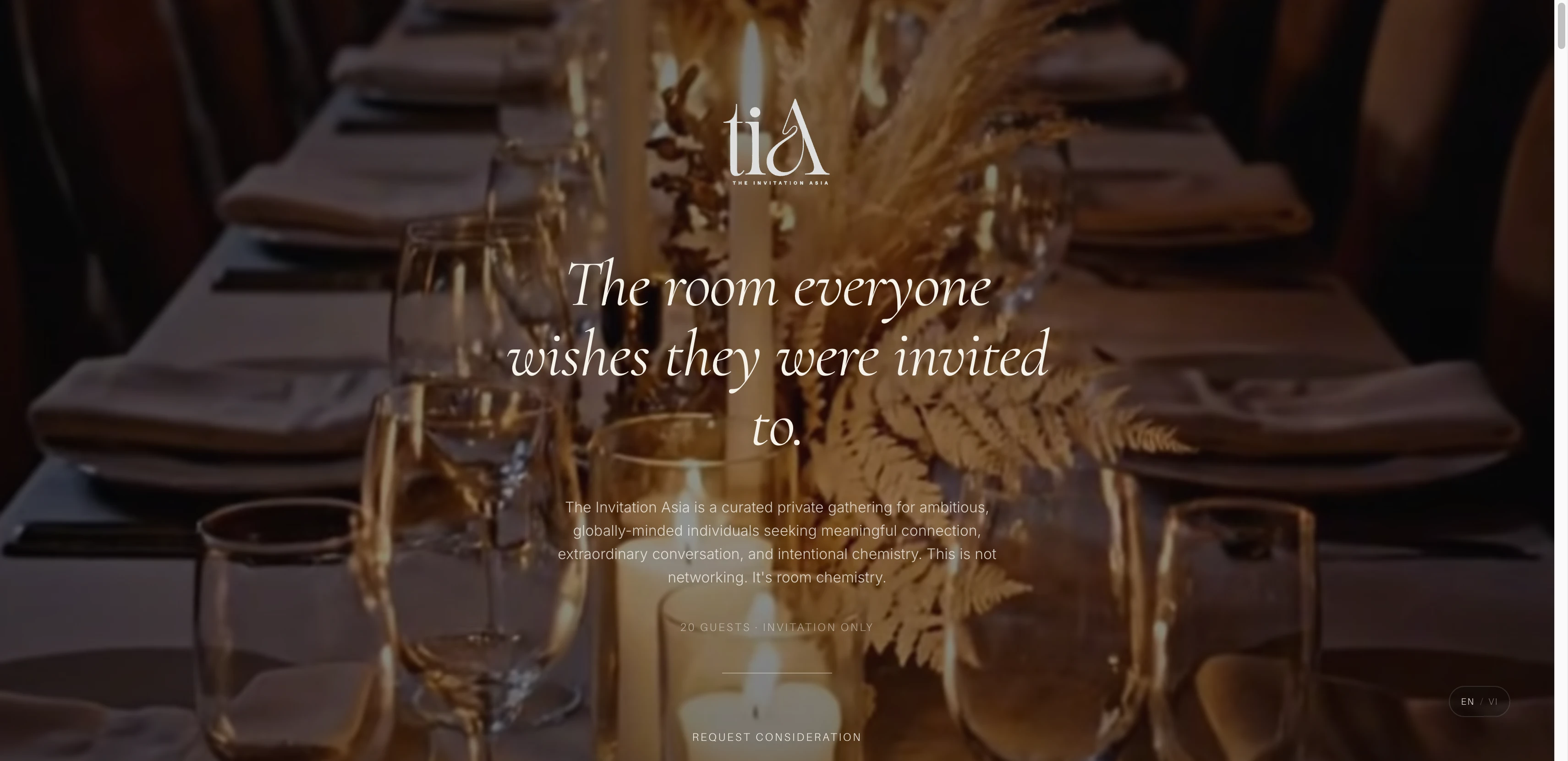
The Challenge
The Invitation Asia is a private, application-only social gathering in Da Nang, Vietnam, bringing together founders, investors, creatives, and tastemakers for a curated evening. The brand needed to communicate exclusivity and quality before a guest ever applies. The website had to do the work of a velvet rope: signal that this is not for everyone, attract the right people, and filter out the wrong ones, all without saying a word about who is or is not welcome.
The Research
We started with a clear brief from the founders: this should feel like a private members club, not an event page. The tone they described was "quiet luxury." Sophisticated, understated, and authoritative. Not hype language. Prestige language. The kind of thing where if you know, you know.
We studied how the world's best members-only brands communicate online. Soho House, The Ned, Zero Bond. The pattern is consistent: restraint, negative space, editorial typography, and just enough information to create intrigue without satisfying it. Every additional sentence is a leak in the mystique.
The competitive audit of Asia-Pacific events revealed a gap. Most curated gatherings rely on word-of-mouth and a basic Instagram presence. None had a digital brand that could stand alongside international private clubs. The opportunity was to build something that felt like a quiet global institution in the making.
How TIA Compares to Similar Events in Asia
| Feature | The Invitation Asia | Typical Networking Event | Members Club | Social App Event |
|---|---|---|---|---|
| Application-only entry | ✓ | – | ✓ | – |
| Cinematic web presence | ✓ | – | – | – |
| Curated room chemistry | ✓ | – | ✓ | – |
| Multi-phase guest journey | ✓ | – | – | – |
| Bilingual (EN + VI) | ✓ | – | – | – |
| Intentional curation criteria | ✓ | – | ✓ | – |
| Post-event brand loop | ✓ | – | – | ✓ |
The Guest Journey
- 1Discovery
Personal outreach, referrals, or curated social presence. Never a public ad.
- 2Explore
The website establishes the world. Cinematic, minimal, intentionally incomplete.
- 3Apply
"Request Consideration." Questions trigger reflection, not just data collection.
- 4Curation
3 to 10 days of review. Scarcity and anticipation build during the wait.
- 5Acceptance
A personal message, not a ticket confirmation. "You were selected intentionally."
- 6Immersion
Pre-event PDF, dress guidance, day-of message. Each deepens investment.
The Approach
The brand brief was explicit: this is not a dating service, not a networking event, not a startup mixer. It is a curated private gathering for high-performance individuals. Founders building something meaningful. Creatives with taste and substance. Investors seeking depth. Operators connecting industries. People who understand that energy matters as much as achievement.
The brief also defined what TIA is not for: transactional networking, self-promotion, influencer culture, loud luxury, performative status. That line became the filter for every design and copy decision. Would this element attract the right people, or would it attract everyone?
The application form was designed as part of the filtering psychology itself. The language was changed from "Apply Now" and "Sign Up" to "Request Consideration" and "Submit for Review." The questions were written to trigger self-reflection: What do you value in the rooms you choose to enter? What makes someone unforgettable to you? Tell us something that cannot be understood through your resume. Applicants who find these questions uncomfortable are not the right applicants.
- 1Brand Direction
Quiet luxury positioning. Prestige language, not hype. Editorial identity calibrated for founders, creatives, and investors.
- 2Copy Strategy
Every line of copy written to say less than the reader wants to know. Intrigue over information. Restraint as a design principle.
- 3Guest Journey Design
Six-phase journey from discovery to post-event advocacy. Each phase has its own tone, timing, and emotional objective.
- 4Application UX
Form designed as a filtering mechanism. Questions test presence, curiosity, and self-awareness, not just credentials.
- 5Visual Identity
Deep warm tones, editorial typography, narrow palette. Consistent across website, PDFs, event materials, and social assets.
- 6Development
Custom SvelteKit build with bilingual routing, video optimisation, and application management.
The Design
The visual direction came directly from the brief: think of a dimly lit lounge with gold accents. Expensive, intimate, and secure. Minimalist-luxe. High-contrast, deep tones with moments of warmth rather than loud colour or cluttered layouts.
Typography pairs a classic serif for headings with a clean sans-serif for body text, following the brief's direction toward timeless over trendy. The colour palette sits in deep emerald, charcoal, and champagne territory. Nothing competes with the photography.
The website opens with a full-viewport cinematic video that establishes atmosphere before any text appears. The first word a visitor reads is not a feature list or a price. It is a mood. As the user scrolls, sections reveal only what is necessary: the concept, who this is for, who it is not for, and finally the application. The "not for" section is one of the most important design decisions. Few brands have the confidence to explicitly turn people away. That confidence communicates value more effectively than any testimonial.
The Build
The site is a custom SvelteKit build deployed on Vercel. The video hero uses lazy loading and adaptive quality to maintain fast load times across connection speeds, critical for the Da Nang audience where mobile network conditions vary.
The application form is a multi-step flow that collects information progressively, keeping each step short to reduce abandonment. Form labels and confirmation copy were written to match the brand voice at every touchpoint: "Request Consideration" not "Submit," "Your application is under review" not "We'll be in touch."
Bilingual routing handles language switching at the layout level, with separate content files for English and Vietnamese. SEO and Open Graph tags are configured per language for correct indexing and social sharing. The waitlist page ("Not this gathering. Perhaps the next.") was built as a separate conversion path for applicants who miss the capacity cutoff.
The Result
The Invitation Asia launched with a digital brand that matches the quality and exclusivity of the physical experience. The six-phase guest journey transforms a social event into a cultural brand: discovery, intrigue, selection, anticipation, immersion, and belonging. Attendees leave feeling like co-creators, not customers.
The website functions as both a marketing asset and a filtering mechanism. The right people feel immediately seen. The wrong people self-select out. That outcome is the design working exactly as intended.