
Amplify Music Education
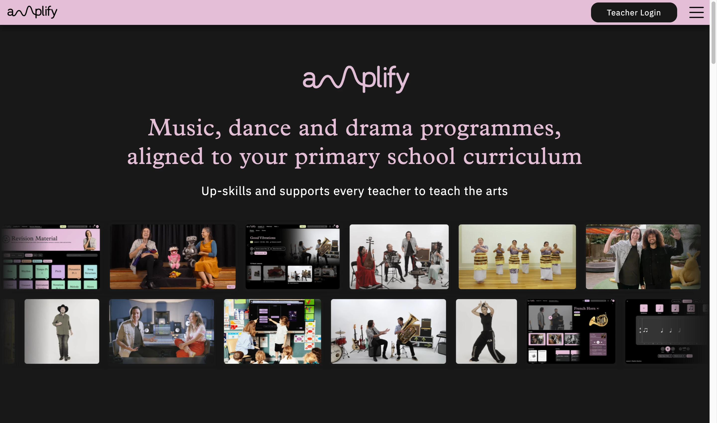
Music, dance and drama programmes aligned to the primary school curriculum. Five interconnected product areas built to upskill and support teachers in delivering the arts with confidence.
The Brief
Amplify delivers music, dance, and drama programmes aligned to the primary school curriculum, upskilling and supporting teachers to teach the arts with confidence. Their platform gives schools a structured approach to arts education without needing specialist teachers.
Sonder Digital built and designed across five interconnected product areas: a public-facing marketing website, an interactive demo system, a suite of in-platform learning games, a design system, and an extended learning module.
The Challenge
The platform needed to speak to two distinct audiences: school principals and administrators making purchasing decisions, and classroom teachers who would use the product daily. Each audience needed a different tone, different information architecture, and different entry points.
At the same time, the interactive learning games needed to meet Learning Experience Design (LXD) standards: intuitive enough for students with no musical background, and approachable enough for teachers without specialist training.
Interactive Games
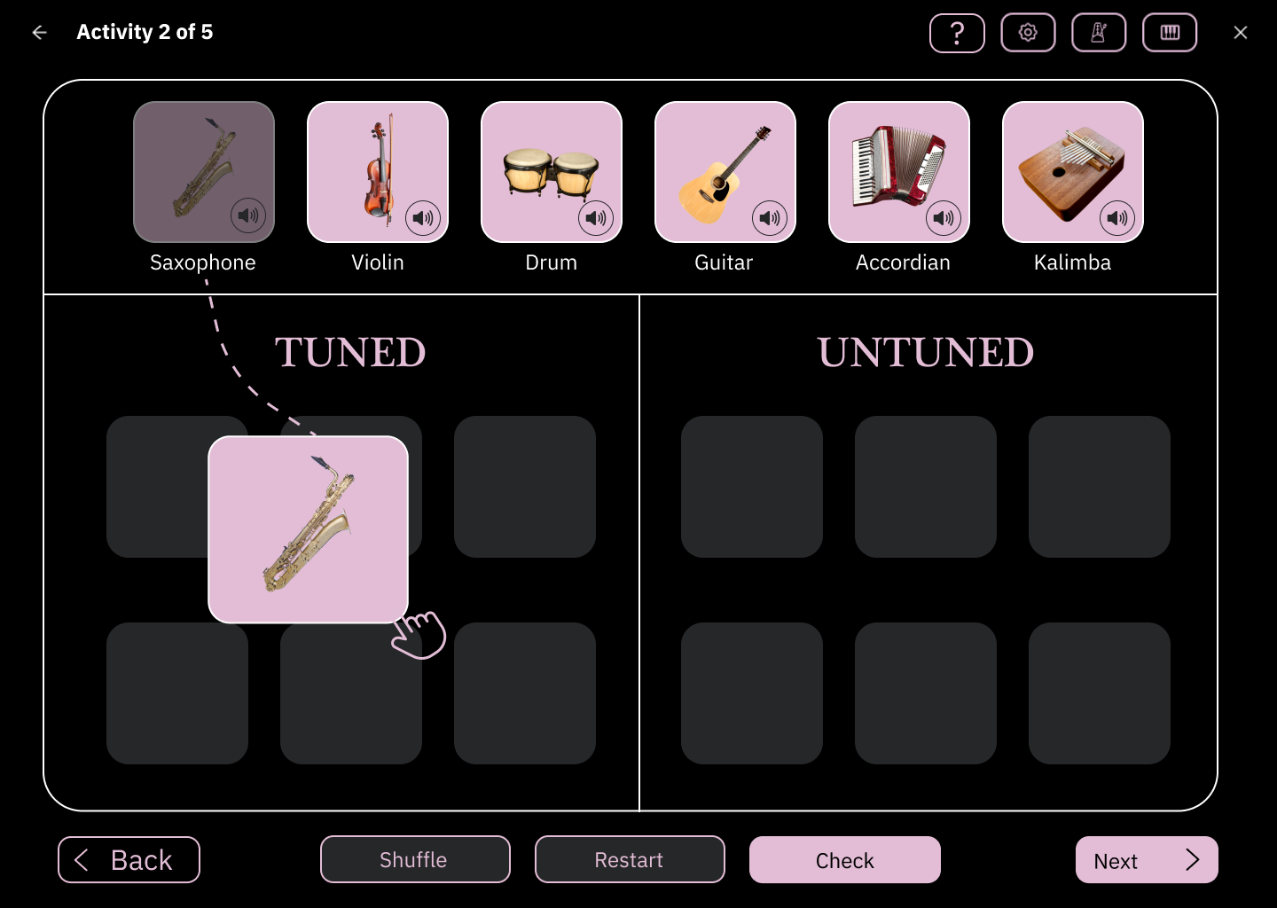
I redesigned interactive learning games that made complex musical concepts accessible to educators and students regardless of their musical background. The work covered drag and drop activities, multiple choice quizzes, sorting exercises, and creative composition tools. Each game was designed to complement the brand while prioritising Learning Experience Design (LXD) principles and educational effectiveness.
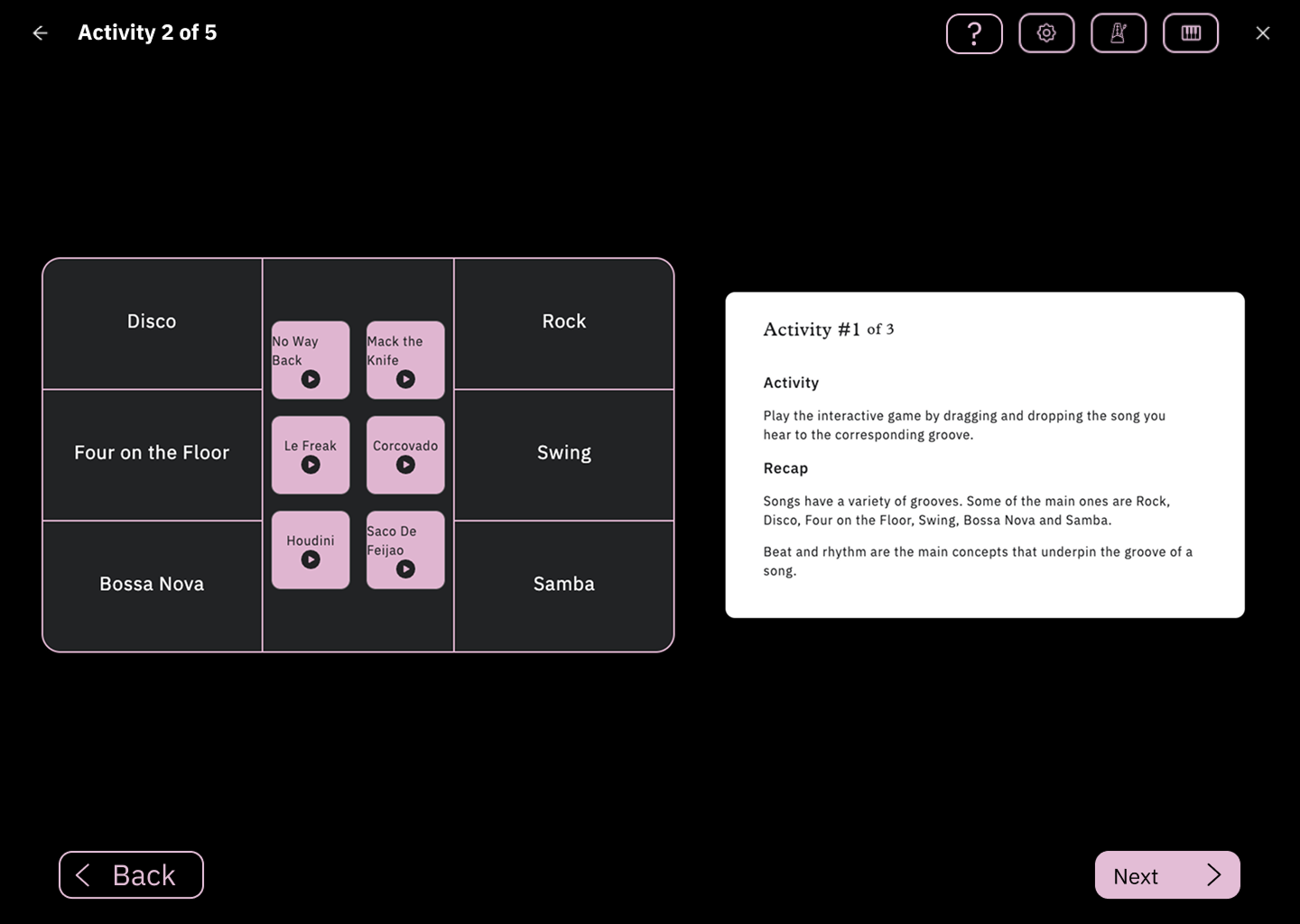
Drag & Drop Game Redesign
The original game had usability issues and did not align with the brand's educational goals. Students found it confusing and teachers needed extensive training to use it effectively.
- Unclear visual hierarchy
- Poor accessibility
- Inconsistent brand alignment
- Confusing user flow
- Clear visual feedback
- Accessible design patterns
- Consistent brand elements
- Intuitive drag interactions
Sort Items Game Redesign
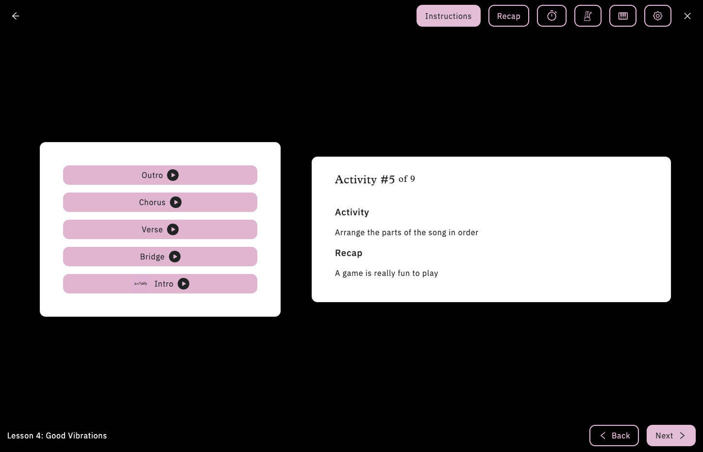
The original sorting game lacked clear visual cues and organisational structure, making it difficult for students to understand categorisation concepts and complete tasks efficiently.
- Unclear sorting categories
- Poor visual organisation
- Minimal user guidance
- Inconsistent interaction patterns
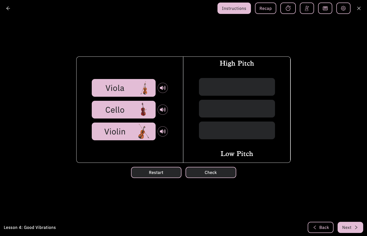
- Clear category definitions
- Improved visual hierarchy
- Enhanced user guidance
- Consistent brand styling
Multiple Choice Activity Redesign
The original multiple choice activity suffered from poor visual design and unclear feedback mechanisms, making it difficult for students to understand their progress and learn from incorrect answers.
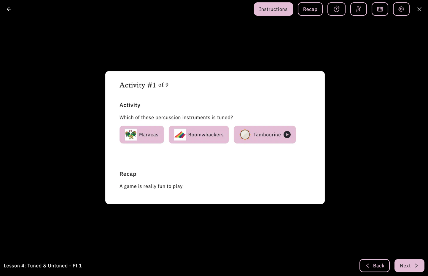
- Unclear answer feedback
- Poor visual hierarchy
- Inconsistent styling
- Limited engagement elements
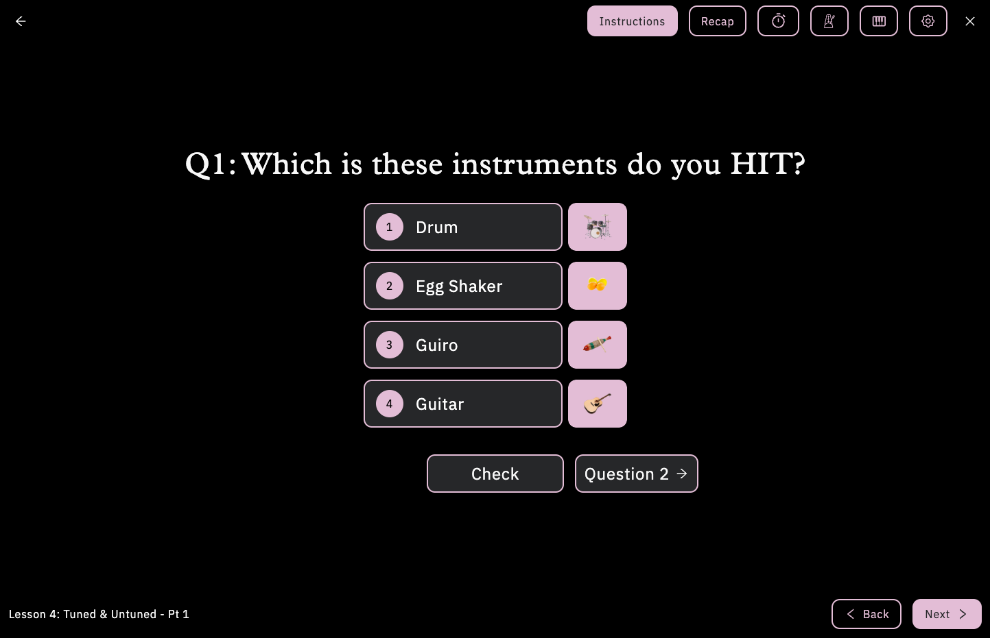
- Clear feedback system
- Enhanced visual design
- Consistent brand elements
- Interactive animations
Want to see the full platform?